Brand identity & creative direction: Saint No Saint, premium Indian streetwear
The founder had a name. Saint No Saint. and a feeling he wanted to build a brand around. That was it. No logo, no colors, no visual direction. Just a name, and the belief that a premium Indian streetwear brand could be built on something more honest than hype.
I came in as Creative Lead at the very start. before the first product, before the first post. My job was to take that name and that feeling and turn it into something a person could hold, wear, and recognise instantly as a brand.
Nothing is purely black or white. People are complicated. they carry contradictions, they shift, they contain multitudes. The gray in between isn't something to fix. It's what makes people real.
This wasn't about saint versus sinner. It was about rejecting the need to be just one thing. The brand says: it's okay to have two sides. It's okay to be both. That idea had to live in everything. not just in a tagline, but in every visual decision, every product name, every detail of packaging.
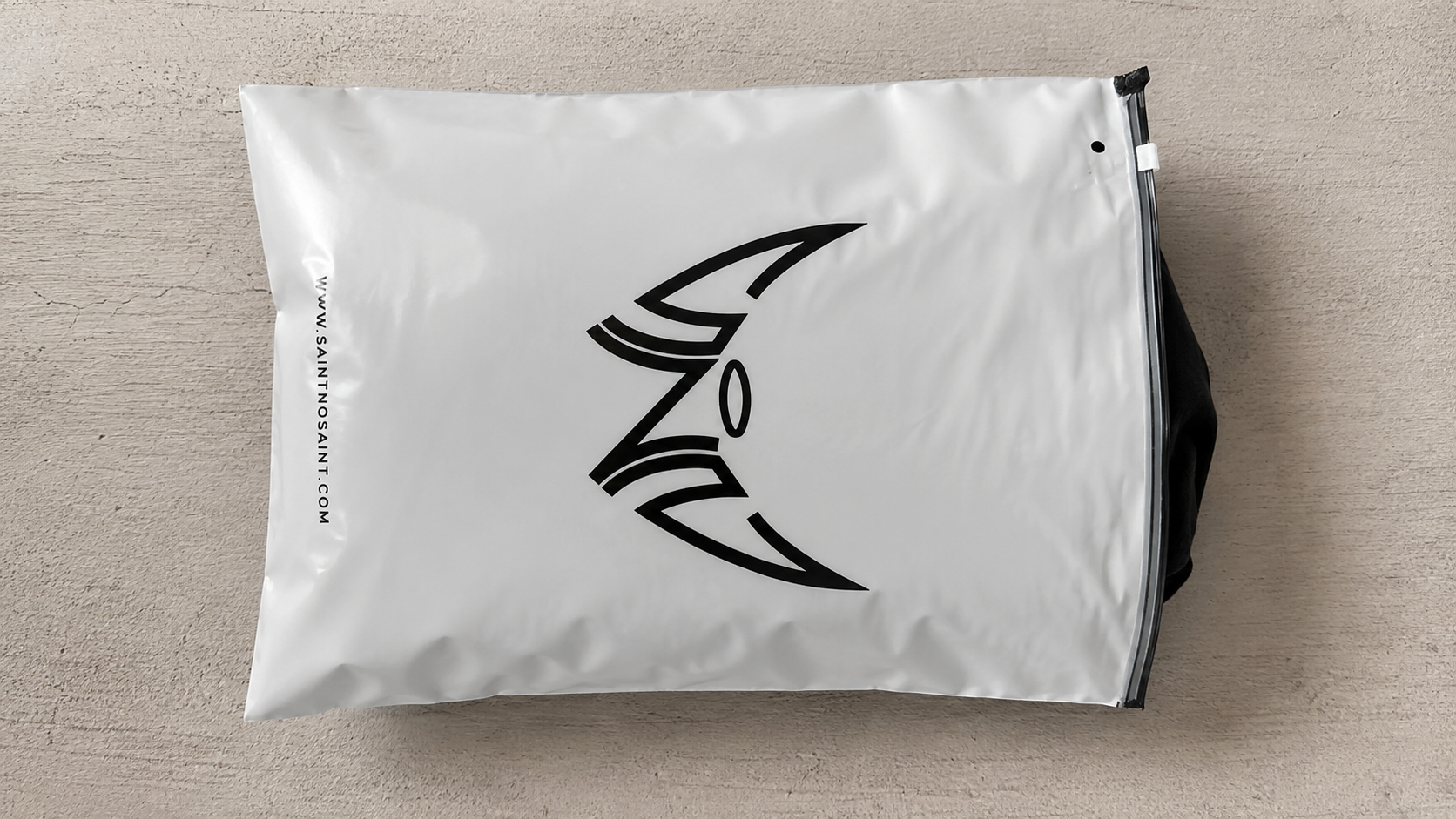
The brief for the logo was really a brief for the brand: make the philosophy visible. No illustration, no metaphor. the letterforms themselves had to carry the idea. I worked with the initials SNS. The two S's were given devil horns. the darker side. The N was given a halo. the lighter side. Three letters. Both sides of human nature. No resolution, no winner. Just the tension held together in a single mark.

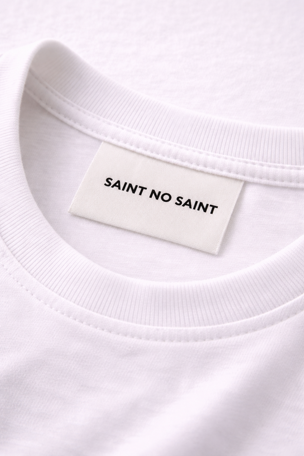
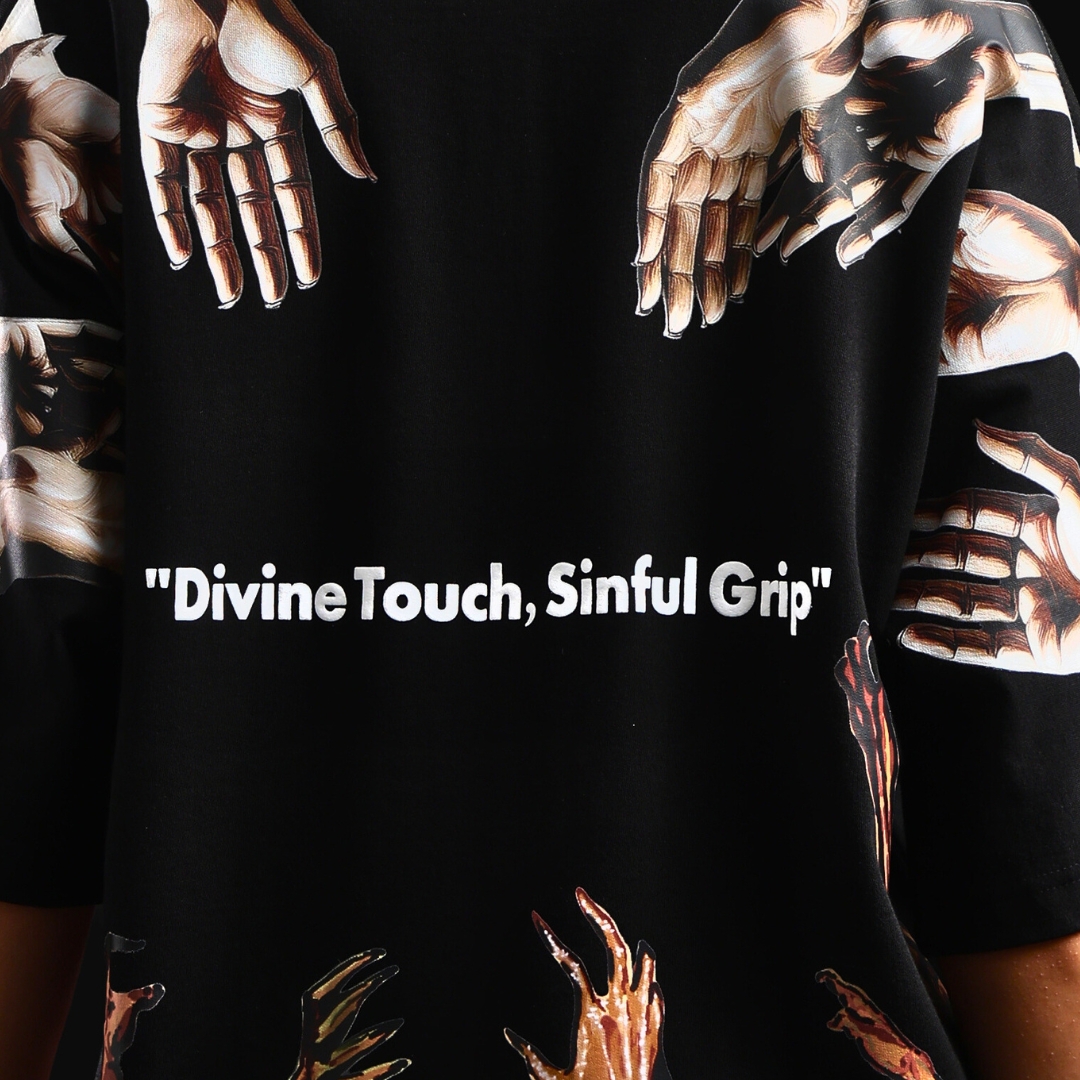
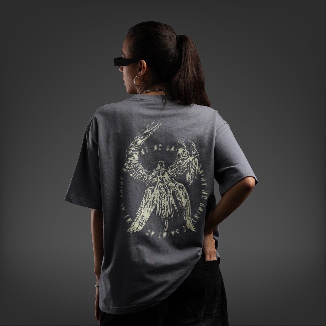
From the logo, every other decision followed. color, typography, tone of voice, visual language. Each one tested against the same question: does this feel like a brand that lives in the gray? The product naming was part of the brand system too. Duality, Saints & Shadows, The Veil of Aura, Human Code. Not just product names, but extensions of the philosophy.
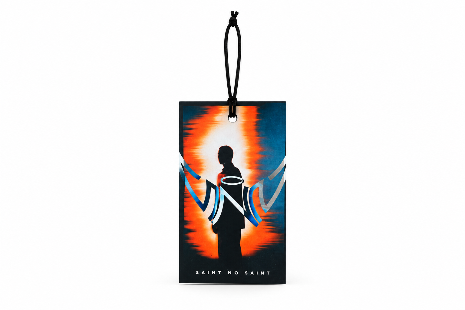
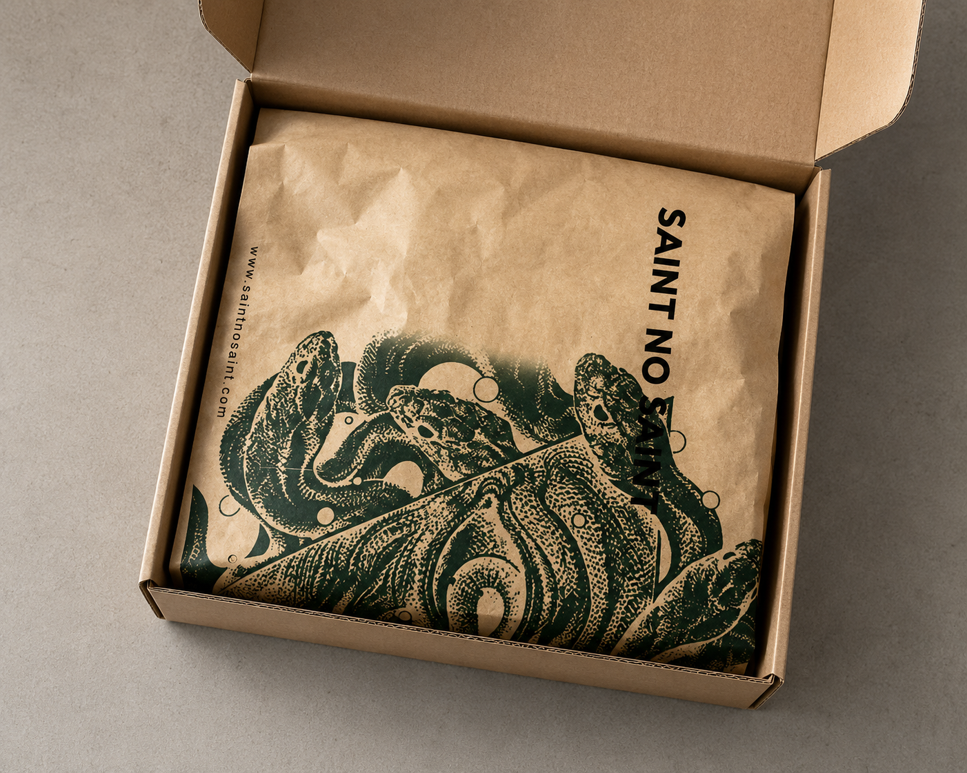
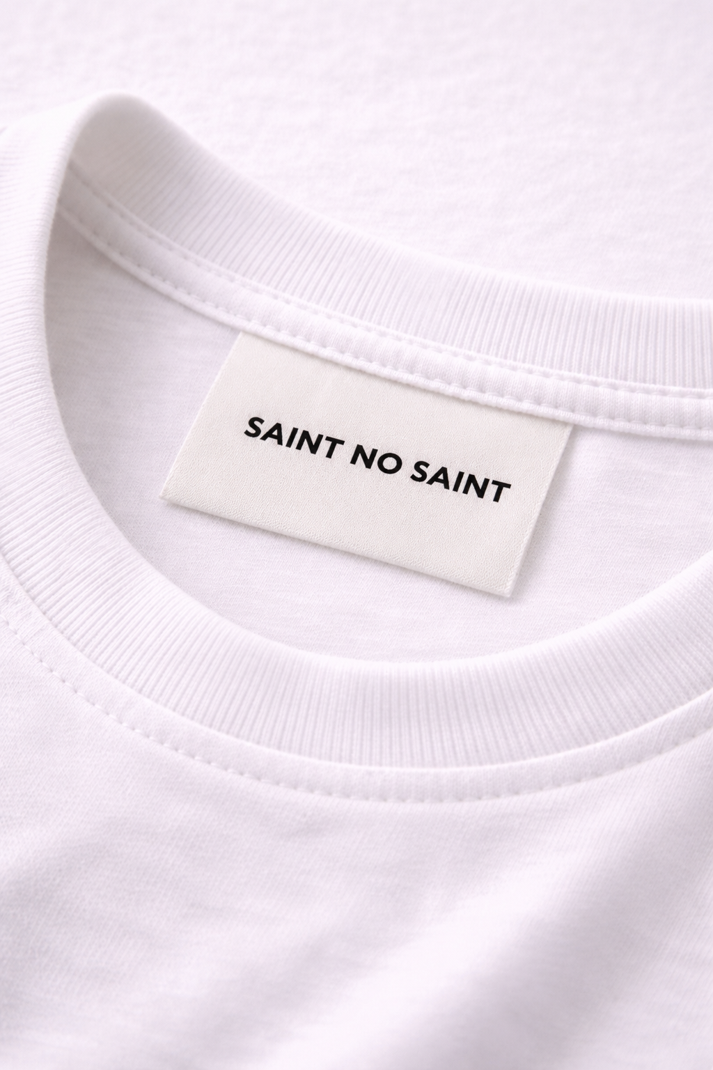
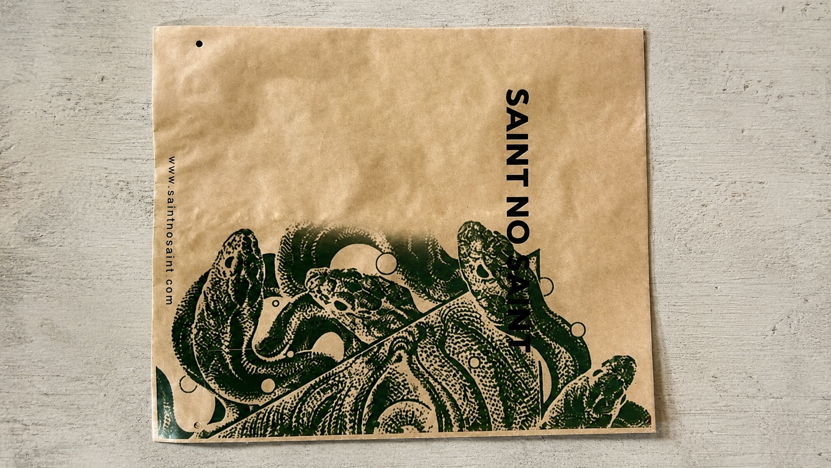
For a premium streetwear brand, the unboxing moment is a brand statement. I designed the full packaging suite. bags, boxes, hang tags, labels, and thank you cards. treating each one as a continuation of the visual language, not an afterthought. Everything intentional, nothing generic.

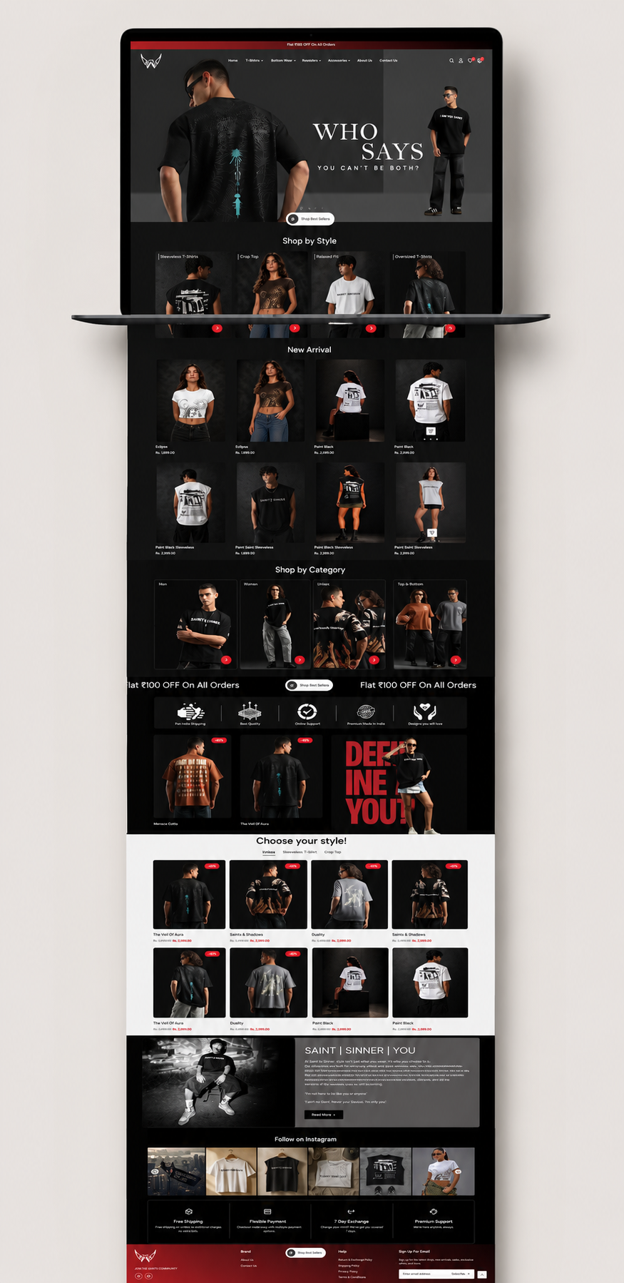
The online presence had to feel as considered as the physical one. Every page, every product listing, every copy decision was an extension of the same brand world.