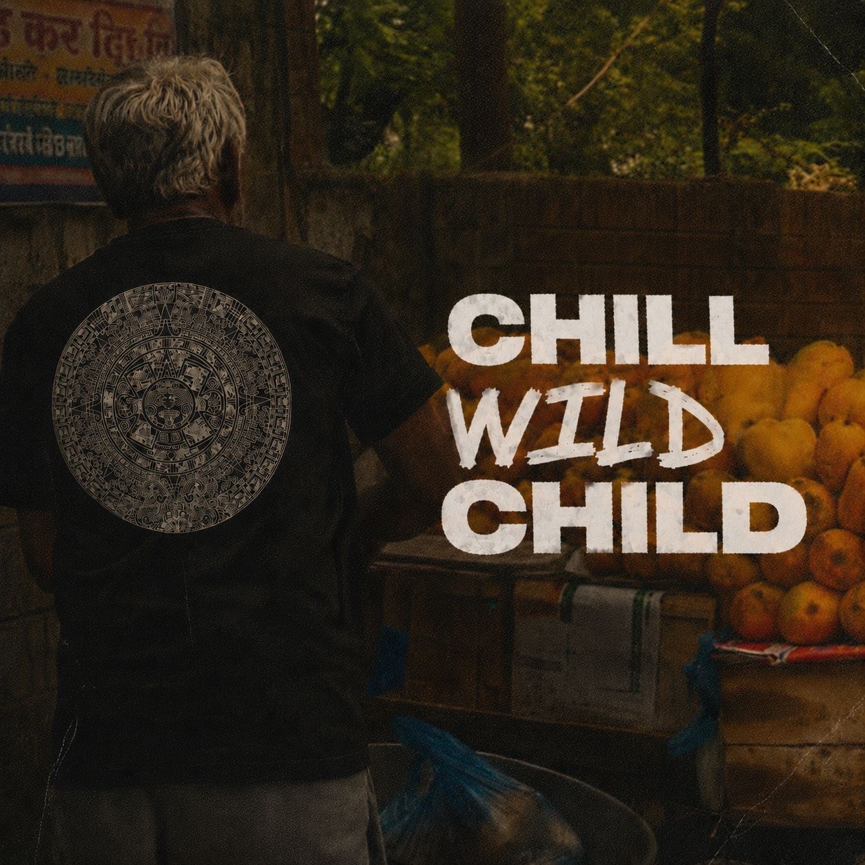
Brand identity, product design & e-commerce: Chill Wild Child
Chill Wild Child started with a feeling shared between two co-founders. the restlessness of being a creative person in a structured world. Sitting in an office, doing the work, but always feeling like a part of you just wanted to climb out and go somewhere wilder. Chilling hard. Living wild. That's the Chill Wild Child state of mind.
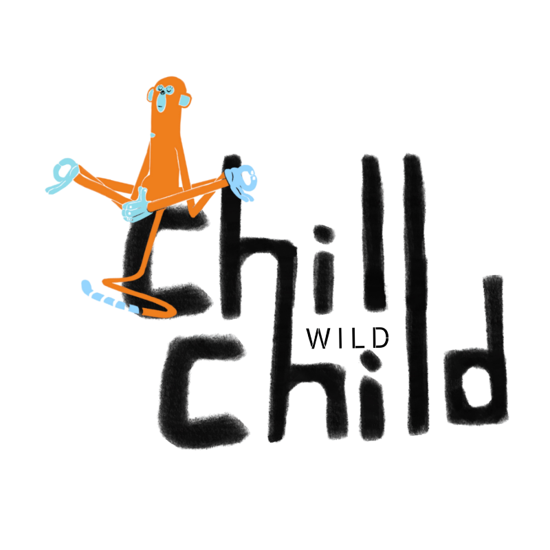
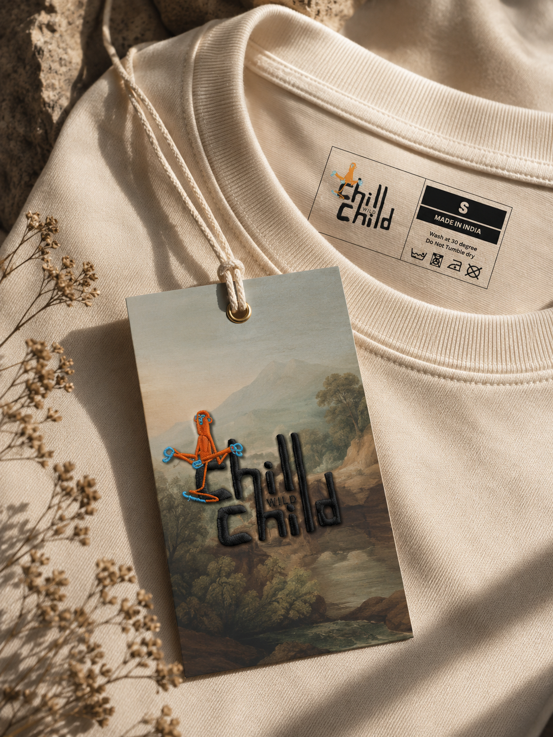
The brand needed a character. something that embodied that energy visually without taking itself too seriously. We landed on a monkey: orange and light blue, sitting right on top of the Chill Wild Child wordmark. Playful, a little chaotic, impossible to ignore. The mascot isn't just a logo. it shows up on every product. It's the brand's face, its personality made visible.
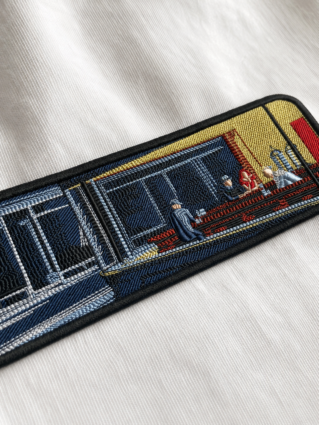
Embroidery is three-dimensional. It catches light. It feels like it was made specifically for you. In a market full of screen-printed streetwear, embroidery signals premium without requiring a premium price tag.
Every piece is made to order. Intricate, detailed stitching on quality fabric. priced accessibly so the premium feel doesn't come with a premium barrier.
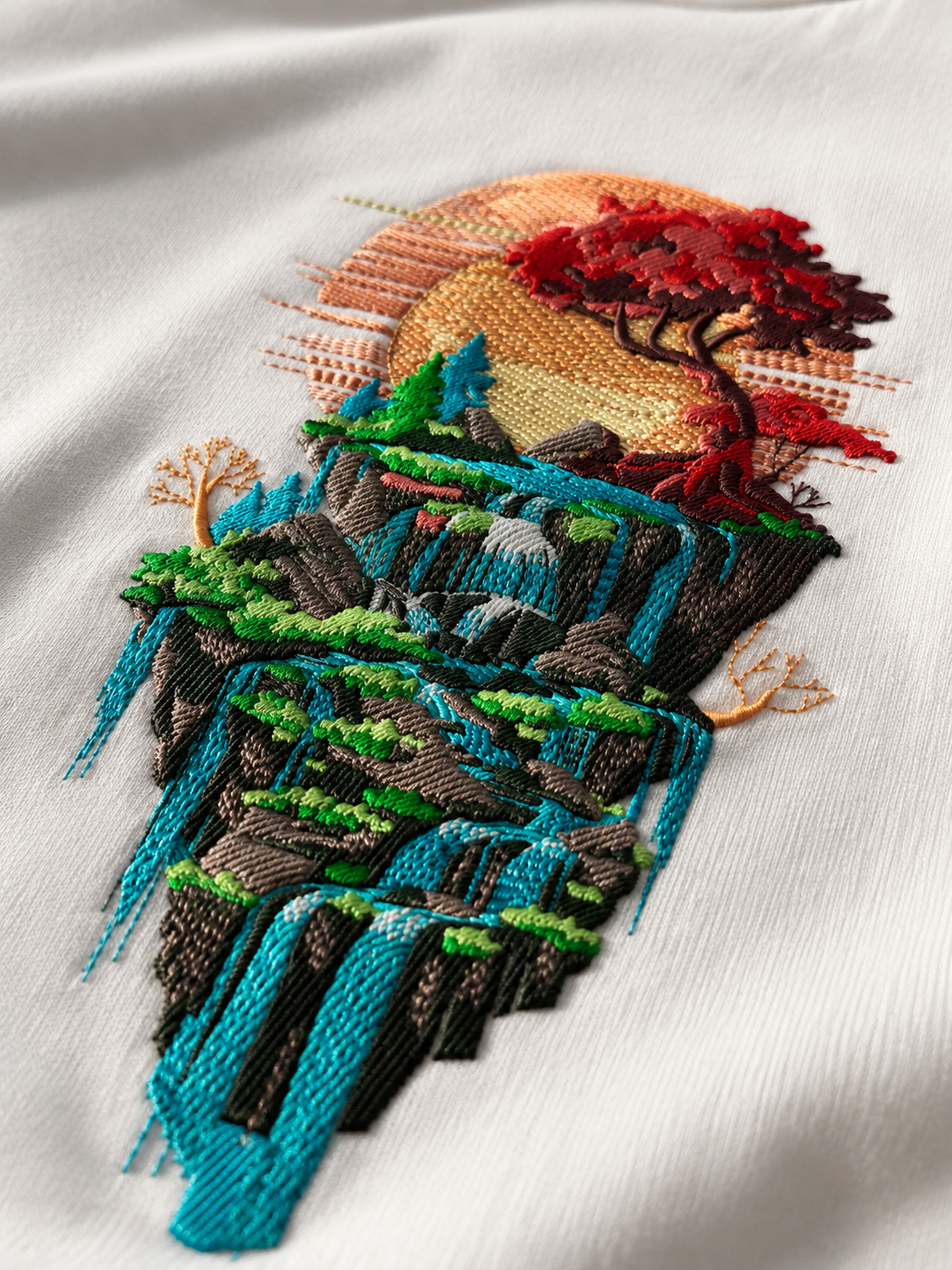
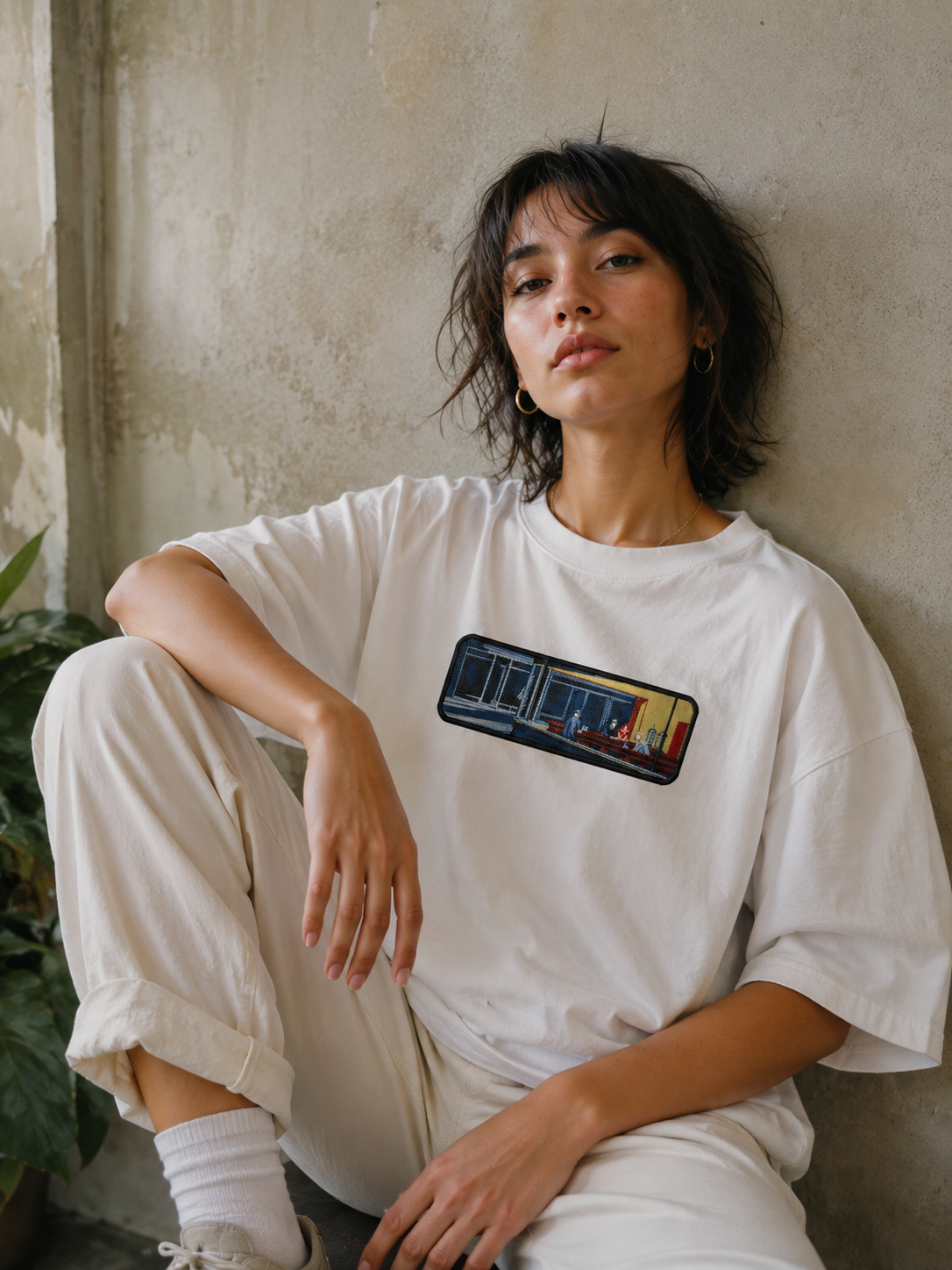
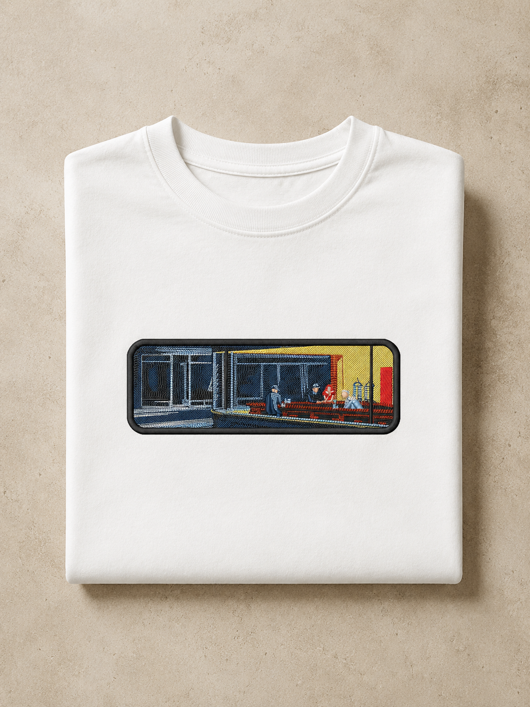
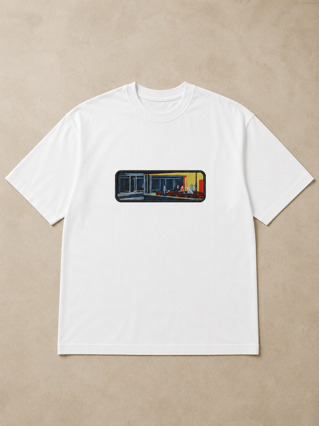
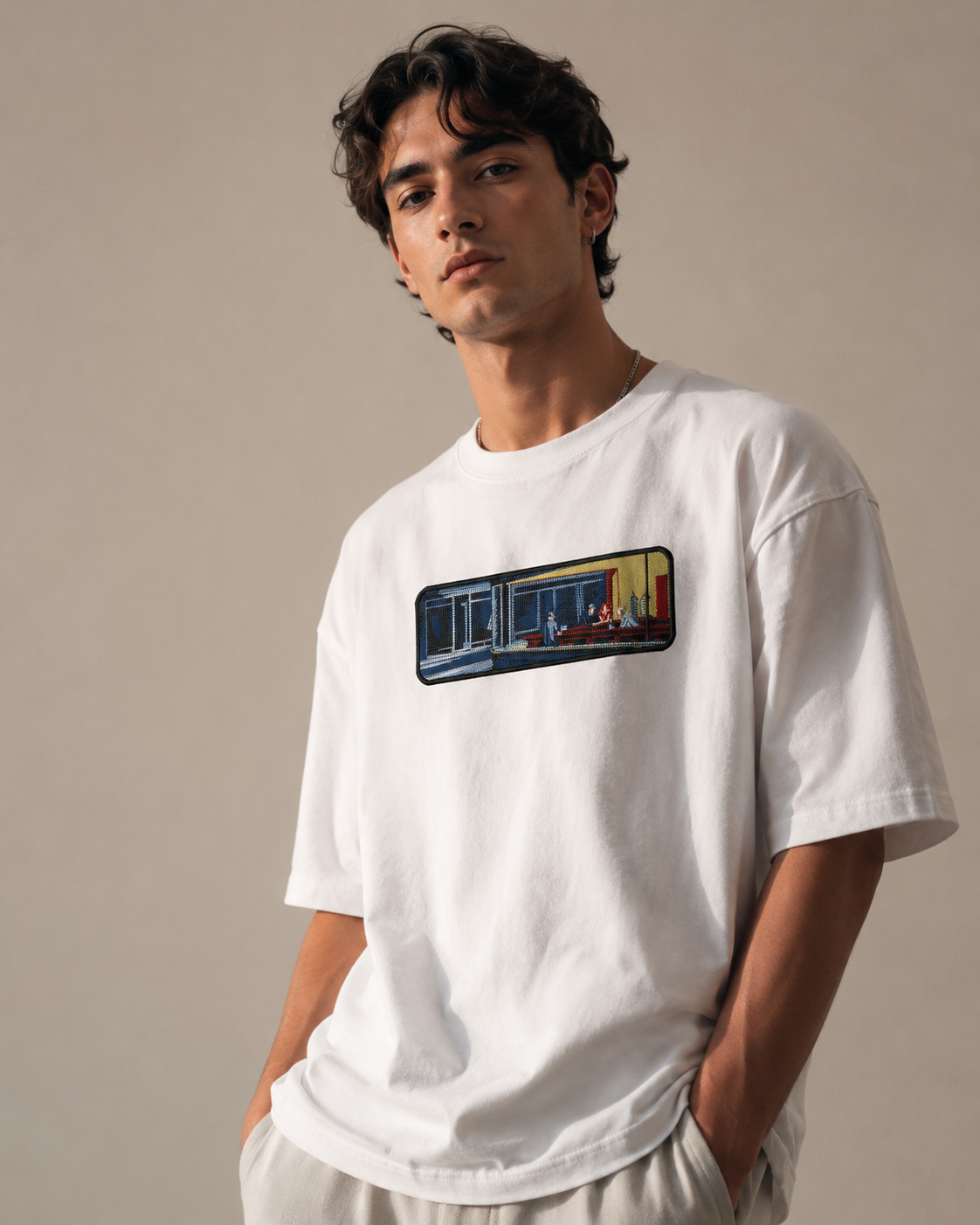
A clothing brand needs a full visual catalogue. but a brand new with a lean budget doesn't have the luxury of multiple shoot days. The entire product photography for Chill Wild Child was produced using AI. giving customers a clear, realistic vision of how each piece looks worn, without a traditional shoot.
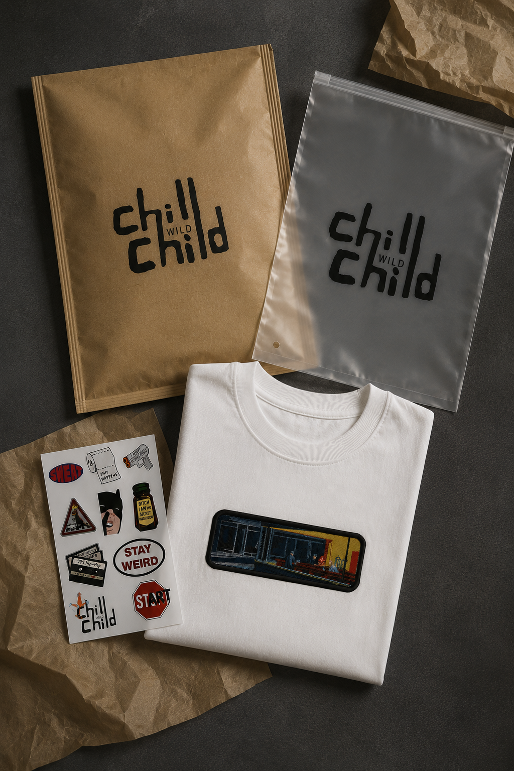
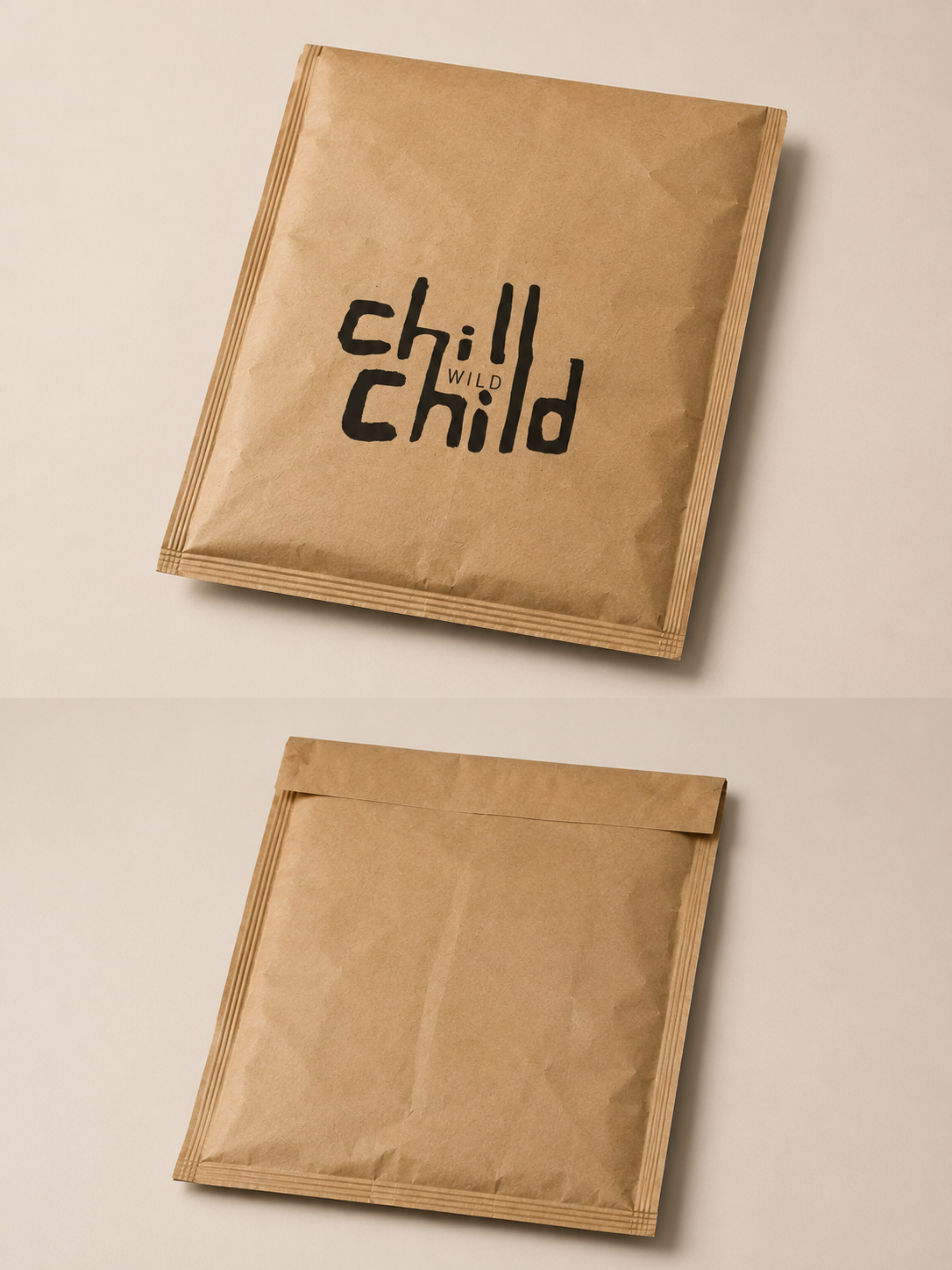
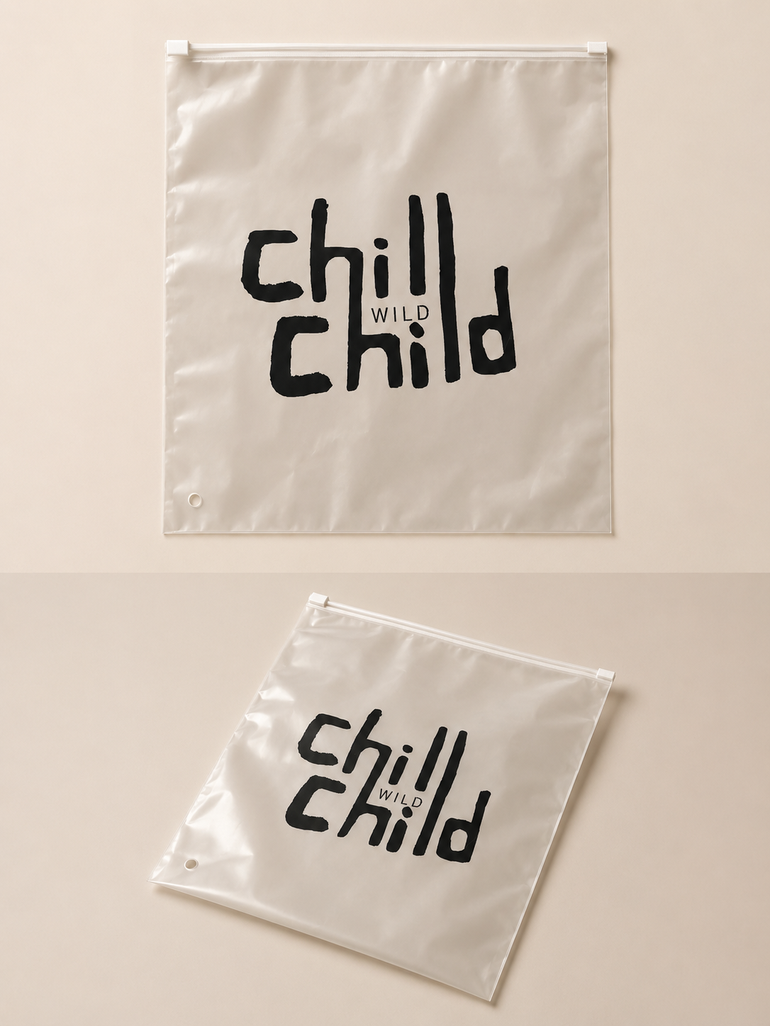
The unboxing moment is part of the brand experience. Paper mailer bags, plastic mailers, and packaging designed to feel as considered as the product inside. every touchpoint a chance to reinforce what CWC stands for.
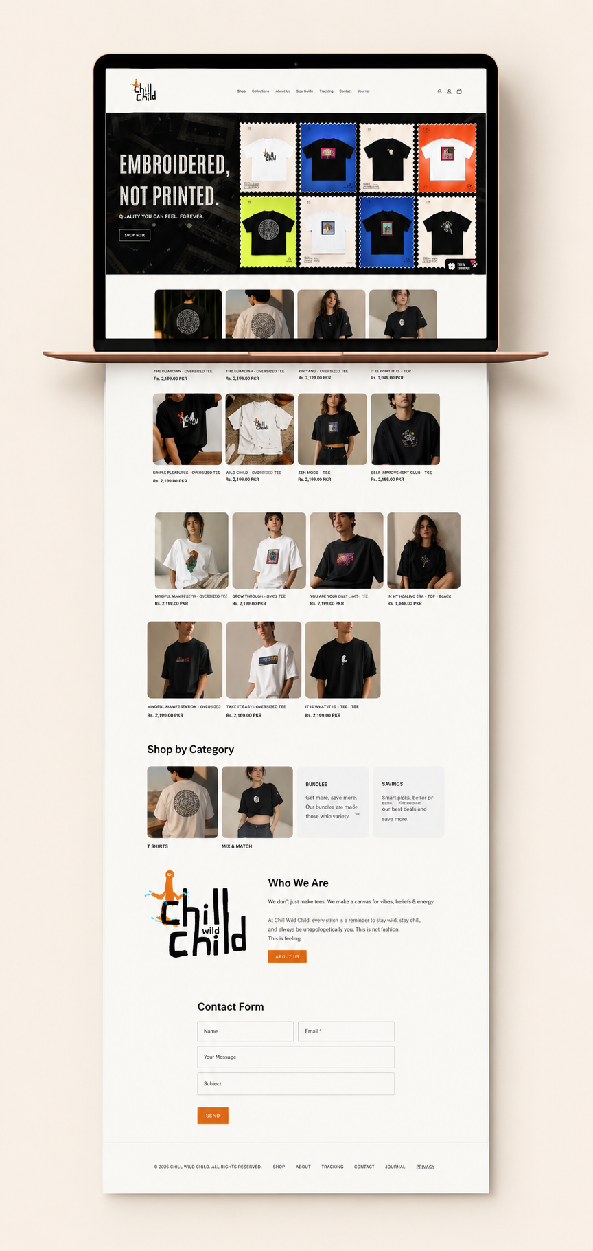
Beyond the brand identity and product design, I built the full Shopify store. architecture, collection structure, product pages, and overall shopping experience. The store needed to feel as considered as the products themselves: clean, direct, and personality-led without being cluttered.